NB: This is a very rare opinion piece from me, so don’t be surprised to see me expressing my views. Ed
At last! A planning application in Ventnor that I can wholeheartedly support.
There was a time when I was pretty keen in keeping an eye on planning applications in our home town.
Our objections to what we saw as carbuncles on the landscape resulted in us (we were told) being barred from certain drinking establishments, simply for saying we objected to ugly designs.
After a while, I became more and more frustrated that despite what appeared to be material planning objections, they were simply ignored and monstrous applications were passed or conditions not enforced, so concentrated my efforts elsewhere.
End of the Gaiety
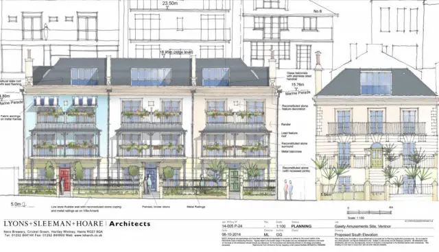
Back in 2015 an application to demolish the Gaiety Amusement Arcade and replace it with three four-floor houses, comprising seven flats, was approved.
Although the design was attractive enough, many of those objecting felt it was too large, blocking the view of the Victorian terraces behind – something that makes standing on Ventnor beach and looking back towards the town, quite magical.
Once approved, many thought it was just a matter of time before the now-tatty, former arcade would be pulled down and replaced.
However, nothing happened, until now.
Hopefully not a poorly-executed pastiche
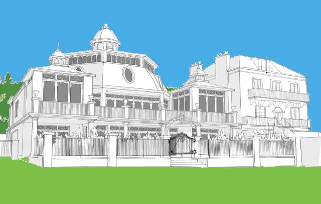
The same architects who managed to get approval for the seven flats in 2015 (Lyons, Sleeman and Hoare) have now submitted another application and it’s one I love!
Assuming the quality of the build is of a high standard and it’s not just another badly-executed pastiche, I believe the design for this spectacular home on the seafront is magnificent.
Attention to detail
I’m may be shooting myself in the foot here, because I’m not an expert in architecture – I just know what I like and don’t like – but the designs for this new home do appear to pay homage particularly well to the former leisure pavilion built at the end of the nineteenth century.
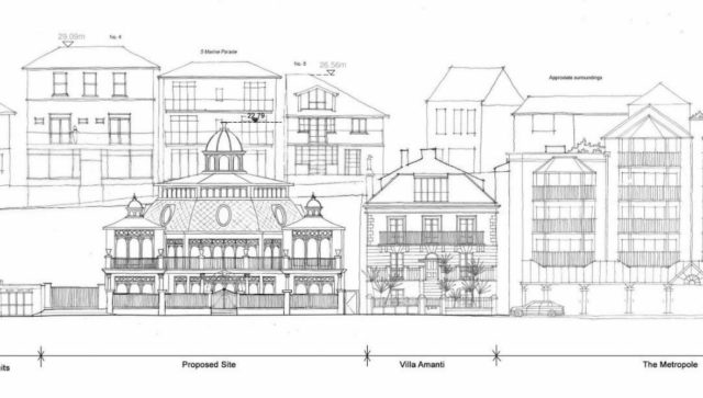
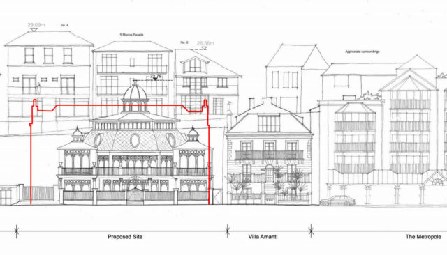
Although the building itself is the same height as the approved flats, it’s less dense and allows views of the terraces behind much more easily.
Not only that, but it looks much more in keeping with our much-loved Victorian Ventnor – unlike, in my view, the Metropole and Mill Bay developments.
Have your say
Anyway, don’t take my word for it, head over to the iWight Planning Website and check out the drawings yourself.
You have until Friday 6th July to make your comments known to the council.
At time of publishing there were three submissions, all in favour.
Image: © Lyons, Sleeman and Hoare


