As regular VentnorBlog readers will know we publish, on a monthly-basis, the figures released by the Office of National Statistics (ONS) on the number of people claiming Job Seekers Allowance (JSA) on the Isle of Wight.
 Some VB readers have asked us if we have any other figures on unemployment on the Island. As the Government doesn’t publish unemployment data monthly, as it does with the JSA figures, we hesitate to use it.
We’ve had a good look at all of the other data that is provided by ONS and have found some that is updated monthly and might give a better picture of what employment opportunities on the Island are like.
It centres around the number of unfilled positions at the Island’s Jobcentre.
We’ve produced three graphs, detailed below.
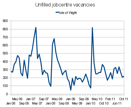
Number of Unfilled positions
This simply reports the number of positions that the Island’s jobcentre had available on a monthly basis. The figures are a snapshot gathered on the day they are collected.
There are some extraordinary swings. Starting in Jan 2008, the difference between the number of jobs that are available in January and February differ massively – eg Jan 2008, 95 jobs available, then Feb 2008 reporting 613.
A large, but less-extreme swing in Jan 2009 – 49 to Feb 2009 – 193.
The most extreme is Jan 2010 which leapt from 75 jobs available to 818 in Feb 2010.

JSA claimants per unfilled position
This plots the number of people claiming JSA against the number of jobs that the Jobcentre has available – eg the number of opportunities those claiming have of getting a job through the Jobcentre.
The higher the number, the harder it is for those people to get a job.
The graph compares the Isle of Wight’s positions against both the South East and the whole of Great Britain.
It’s very clear that the Island has a significantly worse position.

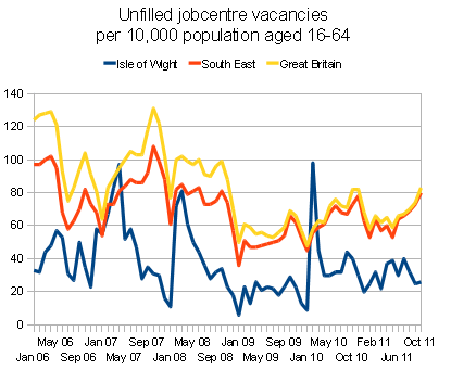
Unfilled vacancies vs working population
Comparing the number of unfilled vacancies against the size of the working population on the Isle of Wight.
Lower is worse because it shows a limit on the number of job vacancies available to those of working age.
Again, you can see the comparison against the South East and the whole of Great Britain.

For those wanting to look further in to the Office of National Statistics figures, they have light detail guidance and one far more in depth.
What do you think?
We’d be really interested to hear what your thoughts and insights are into these figures, graphs and why the figures jumps so madly in January/Feb (We’ve got some ideas, but a breadth of opinions is always good).


